Comparison between Our World in Data and the CDC data. United States: Daily number of confirmed COVID-19 deaths.
Something is odd here
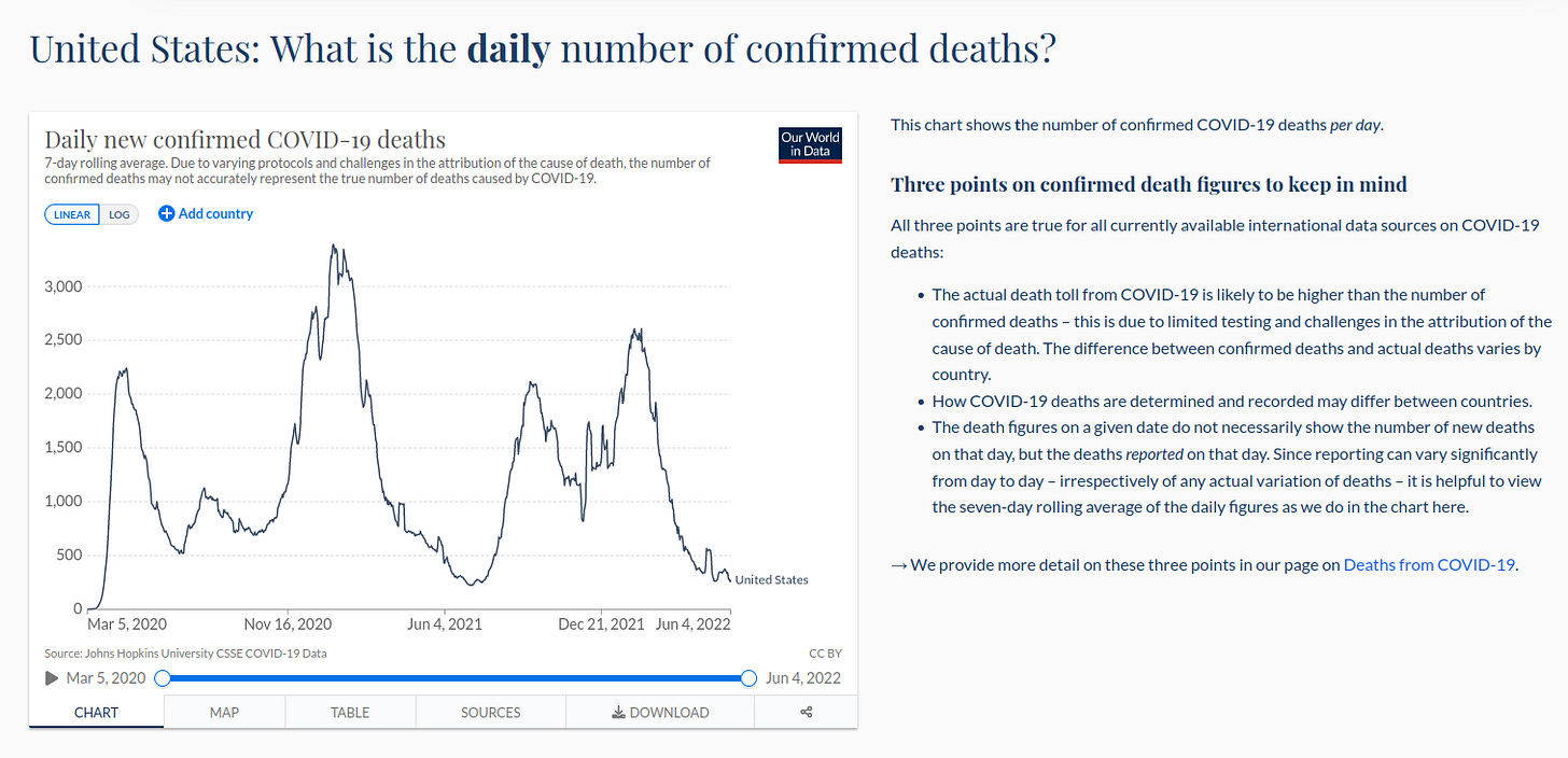
First of all we have to download the data for the daily number of confirmed COVID-19 deaths in the United States from Our World in Data (1). You can see the chart given by the website here:
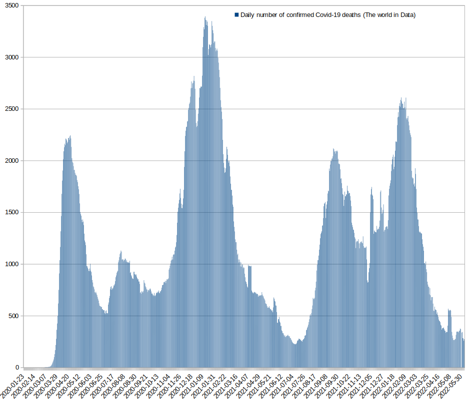
and this is the chart reproduced after we downloaded the data, so we can verify that the data is ok:
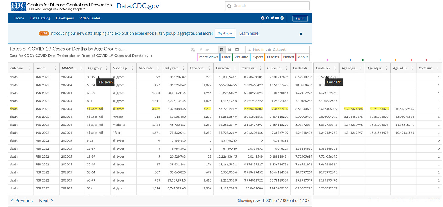
The second step is to obtain the same data from the CDC (2) website, which is presented by vaccination status, very useful, in the following format:
If we look at the underlined row, what they are trying to obtain is the number of COVID-19-associated deaths per 100,000 population by vaccination status. So the equation would be
(Week average of COVID-19-associated deaths by vaccination status)*100,000/(Number of vaccinated-unvaccinated people)
We focus on all ages and all types of vaccines.
For the vaccinated 3439*100,000/132508546 = 2,59530430588227871733
For the unvaccinated 5230*100,000/55723221,9 = 9,38567409003318955611
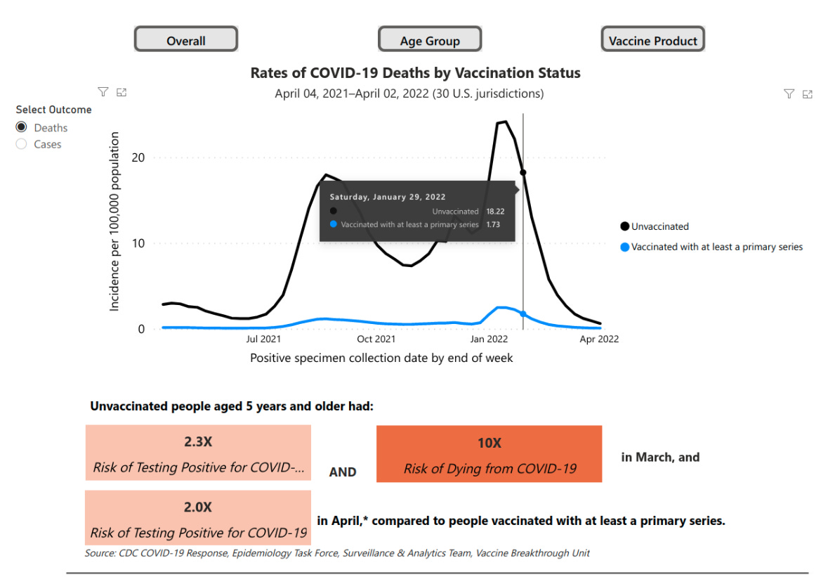
Then they take the age ajusted values (vaccinated = 1.73, unvaccinated = 18.22) as we can see in their chart for that given date, the one we have chosen as an example on how to read the data from the CDC website:
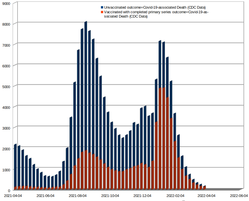
Now we are ready, after downloading the data from the CDC website, to extract the weekly number of COVID-19-associated deaths by vaccination status in the United States:
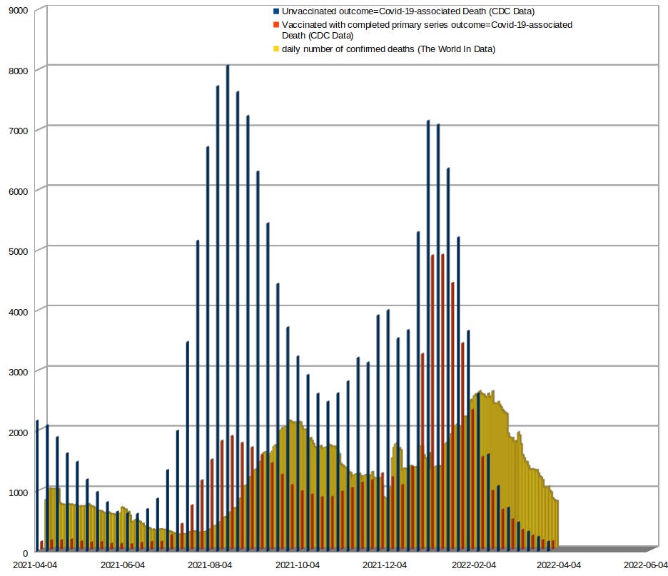
Finaly if we put together the CDC data and the data from Our World in Data we have a very odd result:
First we can clearly see that there is a shift between the peaks of both subsets of data. That is most probably explained by a delay in the reporting from the CDC to Our World in Data.
From the CDC website (2) we can see that their definition of COVID-19 death is:
“A COVID-19-associated death occurred in a person with a documented COVID-19 diagnosis who died”.
Probably some of those deaths are filtered as non-COVID deaths before they are reported to Our World in Data and that is why the numbers are reduced, considerably, in the charts. However the most interesting thing here is that you can reproduce the numbers of Our World in Data considering only the COVID-19-associated deaths from the vaccinated population. That doesn’t mean, of course, that there has been no COVID-19-associated deaths in the unvaccinated population. What it really means, is that the CDC has a lot of “opportunities”, let’s say, with this data, to convinced the public of things like… The Risk of Dying from COVID-19 is 10X for the unvaccinated people aged 5 years and older:
Most of the deaths that they use for that conclusion, ARE NOT EVEN COVID RELATED. We can clearly see that, by comparing these two subsets of data.
NOTE: There are probably other factors involved here that are unfamiliar to me and can contribute to explain this discrepancy. Nevertheless, in my opinion, these numbers should be the same, after they have been properly verify. But it seems that some people are not interested in that degree of accuracy, for the same reason I alredy explained in my previous substack
THEY WANT TO USE THESE NUMBERS AS A POLITICAL WEAPON TO TERRORIZE THE POPULATION AND IMPLEMENT DRACONIAN MEASURES OR FORCE EXPERIMENTAL PRODUCTS ON PEOPLE
References:
(1) https://ourworldindata.org/coronavirus/country/united-states
(2) https://covid.cdc.gov/covid-data-tracker/#rates-by-vaccine-status


